With retail store design and development, as with many things in life, simple is often better. In a world of continued product proliferation, excessive purchase choices, overly complex messaging, and technology-enabled shopper distraction, those in charge of retail store design and development would be well served to take a step back and think about how to simplify the retail experience. The benefits of simplification are a bit like the feeling of organization, empowerment, and clarity you get when you declutter your closet.

In a recent Forbes article, retail expert Sanford Stein tells the story of Vuori’s decade-long journey from start-up to the company it is today with 32 of its own stores, distribution in over 2000 retailers, and a company valuation greater than publicly-traded companies such as Under Armour, Gap, and Urban Outfitters. Having the opportunity to work hand-in-hand with Vurori on its store buildouts has brought to light the power of tasteful, yet well executed simplicity and the benefits of creating retail environments that share the same DNA as the brand. The article highlights Vuori’s Mall of America store, its most recent flagship following others like its beautiful flagships in New York City, Chicago, and Las Vegas.

Like the understated logo on its comfy performance apparel, Vuori’s stores are clean, uncluttered, and simple when it comes to layout, material choices, and fixture structure. There are lots of white walls with embedded shelf standards and a wide range of configurable accessories such as shelves, apparel bars, and face-outs. Many of the fixtures are constructed of white oak with natural finishes including special cement-like finishes.
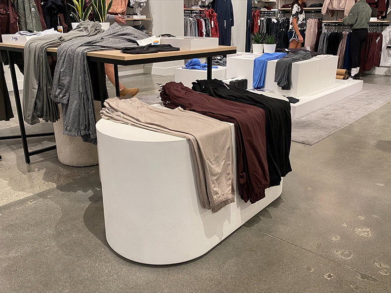
There are cashwraps and backwraps, platforms, merchandising tables, simple metal fixtures for hanging apparel, and art frames with easy-to-change inspirational lifestyle graphics. It all works together to create the right vibe, and at its core, it speaks to the power of simplicity.


We’ve seen the benefits of simplicity with lots of other store buildouts we have done as well. Our work in the resort and hospitality industry also bears testimony to the power of simplicity, and reinforces the importance of creating a retail vibe that fits the brand. In the same way that Vuori stores reinforce the California casual feeling, the shops we built out at Hotel Del Coronado, one of the oldest and most iconic hotels in the country, had much more of a beachy feeling. We used a lot of the same materials such as white oak, but white washed finishes and a spacious layout helped to create a relaxed shopping environment. And, of course, the decorative accents helped to drive home the luxury boutique feel.
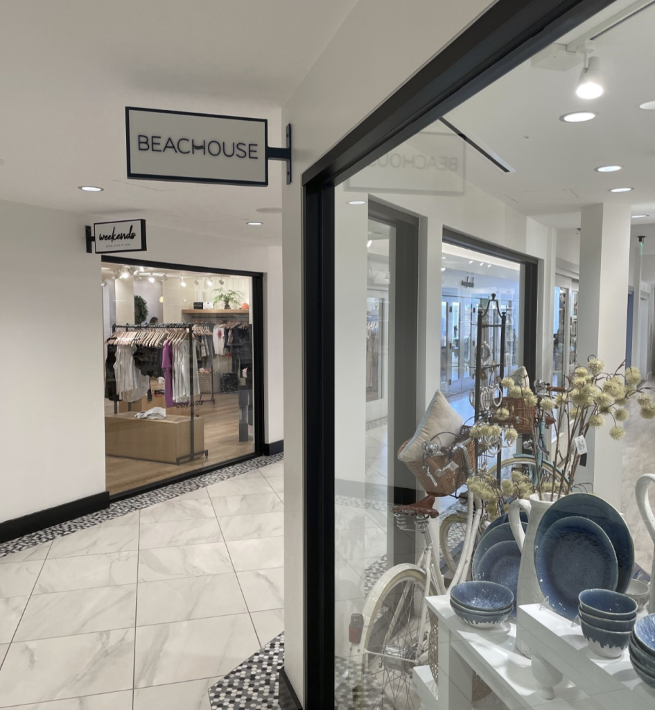

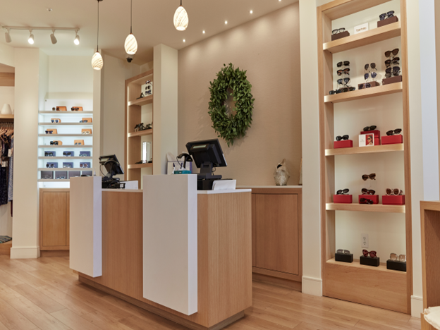

While there is a clear benefit to leveraging simplicity in in the apparel space and in creating the right resort shopping environment, keeping things simple when introducing newer retail concepts is also advisable. For example, we helped Rebel Fit Nutrition launch a new retail concept that combines nutritional supplements, apparel, and a smoothy bar. White wall with flexible and configurable merchandising accessories, rift cut white oak, and black accents provided the foundation for an inviting and comfortable retail experience.

As with our other examples, we tried to keep things super simple when we did the buildout for Encinitas, California-based Local Scoop, a zero-waste package-free food store. We designed a built-in birch plywood bin system for bulk food dispensers that was very basic, highly functional, and cost-effective. We kept the other fixtures simple and straight forward which fit well with the eco-friendly ethos of the Local Scoop brand.

There is power in simplicity. Sometimes less is more.
Jim Hollen is the owner and President of RICH LTD. (www.richltd.com), a 35+ year-old California-based point-of-purchase display, retail store fixture, and merchandising solutions firm which has been named among the Top 50 U.S. POP display companies for 9 consecutive years. A former management consultant with McKinsey & Co. and graduate of Stanford Business School, Jim Hollen has served more than 3000 brands and retailers over more than 20 years and has authored nearly 500 blogs and e-Books on a wide range of topics related to POP displays, store fixtures, and retail merchandising.
Jim has been to China more than 50 times and has worked directly with more than 30 factories in Asia across a broad range of material categories, including metal, wood, acrylic, injection molded and vacuum formed plastic, corrugated, glass, LED lighting, digital media player, and more. Jim Hollen also oversees RICH LTD.’s domestic manufacturing operation and has experience manufacturing, sourcing, and importing from numerous Asian countries as well as Vietnam and Mexico.
His experience working with brands and retailers spans more than 25 industries such as food and beverage, apparel, consumer electronics, cosmetics/beauty, sporting goods, automotive, pet, gifts and souvenirs, toys, wine and spirits, home improvement, jewelry, eyewear, footwear, consumer products, mass market retail, specialty retail, convenience stores, and numerous other product/retailer categories.


