Jayna
Gedney wants you to be able to smell her store’s website.
Jayna
is the store manager of Ben Franklin Crafts & Frame Shop in Monroe,
Washington. The store is owned by the Taylor family, established in 1975 by
Adrian and Deanna Taylor. A second store, located in Bonney Lake, Washington, is
owned and managed by son Adrian C. Taylor, their son. The two stores are
creative industry stalwarts. Industry legend is that Adrian, Senior was the
first retailer to embrace scrapbooking, creating the trend we know and love
today.
Now,
we are talking with Jayna about all things “phygital,” a blend of the physical in-store
experience with what’s happening digitally online. And what happens to a
customer who shops via both bricks and clicks.
A
visit to either Ben Franklin Crafts & Frame Shop is definitely an
experience: shoppers are immediately surrounded by all things crafts. Physically,
each sense is engaged. Online, it’s Jayna’s wish that visitors be able to visually
feel the ambiance of her store. And it works because the website isn’t full of
random paragraphs and tiny photos showing item description and price. Instead,
visitors find vibrant photos of actual store displays that are large enough to
show product detail.
The website copy reads, “Assorted Christmas Gnomes. Any of
these adorable Christmas Gnomes will fit perfectly with your existing Christmas
decorations. The hard part will be to choose which one you’ll take home with
you. We have multiple gnome sizes and styles to choose from. (While supplies
last).”
A video offers a sneak peek of the store’s unique Christmas
decorations. The copy invites viewers to “Stop by the store to grab these
beautiful holiday decorations before they are all gone.” The goal, and it’s a
good one, is to set the store up as “Your Holiday Gifts Headquarters,” and not
just a craft store.
The
interesting thing is that neither one of the Ben Franklin Crafts & Frame
Shop stores sells from their website. And that’s okay. Instead, the sites encourage
you to visit the store, or call for more information about products shown.
A
good website brings the complete physical experience to shoppers digitally. Not
every retailer sells online, that’s a choice you need to make for yourself.
There is plenty of information online about SEO and the backend of a reliable
website, but this article is all about the visual and what it takes to blend
in-store and online to deliver a truly phygital experience. Let’s dig in:
1. Your website is today’s business card and every
business should have one. It is not enough to have a Facebook page because not
every consumer is on Facebook. There are dozens of website builders like Wix,
GoDaddy Website Builder, and Squarespace that provide templates to help you create
a professional website fast.
Hen & Chicks Studio has a
moving banner with four different panels that tells visitors more about the
store. One of those panels is of the store exterior. It’s important to remind customers
what your store looks like because it makes it easier to find when they decide
to visit. It also strengthens the physical connection.
2. Your
website will never be perfect. It’s a live entity whose job is to tell a story,
projecting a continuously changing and evolving image of your store. You change
your sales floor frequently so the shopper experience is new each time they
visit, the same goes for your website. On the sales floor this frequent change
happens on your speed bump displays and within your lakefront property. Online,
key changes include fresh photos of store displays, calendars, project sheets,
and product offerings.
3. Navigation
buttons should be easy to find and easy for visitors to hover over. No one
likes a touchy website: you put the cursor on a tab and it goes away, so you
try again and again. Sites like that just send visitors to your competitors.
Make your contact info easy-to-find at the top of
the page and include your telephone number. The number one complaint our focus
groups have about websites is having to hunt for the phone number, or worse
having to google it because it’s not on the website at all. Add a search bar, standard
contact form, social media icons, and even a link to your location in Google Maps.
We’re starting to see more websites adapting to WCAG
(Web Content Accessibility Guidelines) and ADA (Americans with Disabilities
Act) compliance. Companies like UserWay.org make websites accessible for
everyone by adding a widget that enables visitors to click to make text larger,
add contrast, change fonts and text spacing, highlight links and more.
This mock-up is an example of the front page of a
phygital website. You almost feel like you are in the store. Note the search
box, and phone number at the top. The navigation bar is clean and the fonts are
easy on the eyes. When you click on the photo you are taken to a landing page
that provides more information about the product. This is a visual example that
works whether you sell online or not.
4. Work your
landing pages. A landing page is any page that visitors “land” on after clicking
anything on a website. Customers online can also be sent to landing pages through
a link on email, social media, or ads. Their purpose is to encourage visitors
to take action, like shop online, sign-up for classes or email blasts, download
lists or project sheets, even watch a video.
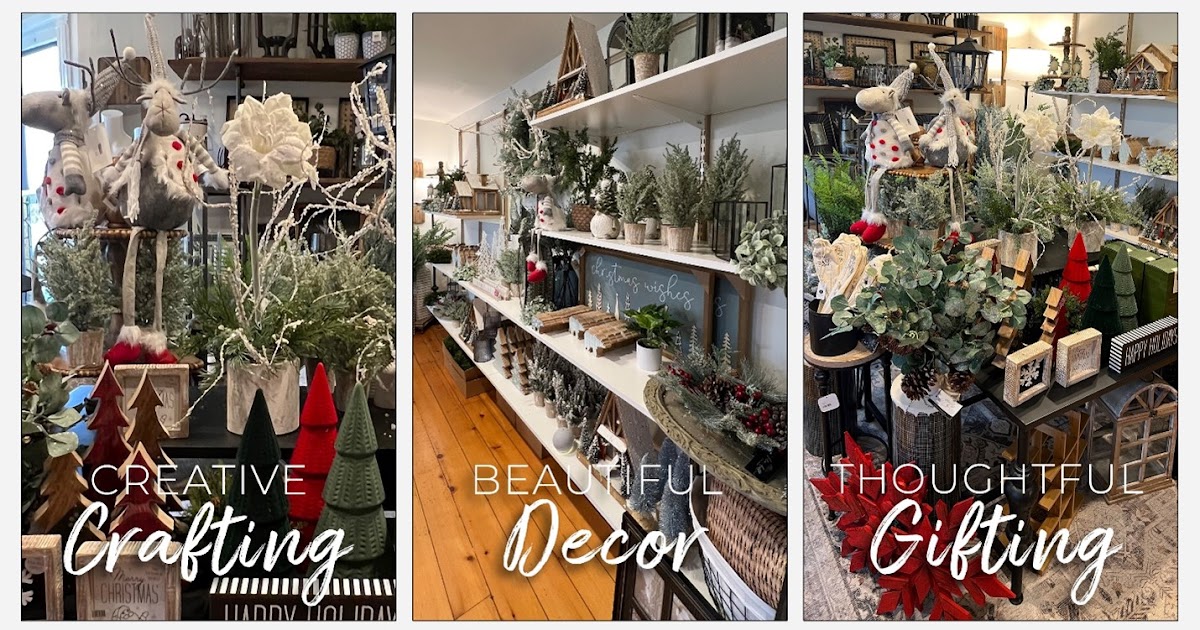
This is the landing page a visitor
would “land” on after clicking “Browse Our Christmas Shop” on the website’s
home page (previous photo). Here, the visitor makes another choice, clicking to
learn more about Creative Crafting, Beautiful Décor, or Thoughtful Gifting. On
each of these pages the visitor is either encouraged to shop online, review project sheets, or learn more about the products that are available in-store.
This is a lead capture landing
page; the object is to get visitors to fill out the form. Here, the call to
action is to encourage visitors to share their email address and telephone
number. This builds a database that will later allow the retailer to engage
customers on a more personal basis.
5. Place essential
information “above the fold.” Back in the heyday of newspapers, the term “above
the fold” was used to describe content that appeared on the top half of the
front page of a newspaper, making those stories the most visible.
Above the fold is also important on web pages. You
want visitors to see what’s most important, and not have to scroll down to find
it. Not every visitor will scroll so big news can be easily missed.
6. Choose a
friendly design, style, and typeface. Just like the 10 second first impression
shoppers make when they enter your store, this happens online too. In fact,
recent studies found people take only five seconds to form an opinion of a
website, and 94% of that judgement is design related.
According to Adobe, different typefaces communicate
different values and meanings. When deciding what’s best for your website, you
want to choose fonts that are easy-to-read, legible, and web safe. A web safe
font works across all browsers and devices – this is critical in communicating
your brand message. The good news is that your website builder will recommend
which fonts are best for your type of business.
The fonts used on the Ben Franklin Crafts &
Frame Shop website are clean and legible. Ideally, two different fonts are
plenty, but some web builders say it’s okay to use up to three but you should stop
there.
7. Consider the
voice of the consumer. When writing copy for your website think about what’s
important to them. Is it an item’s seasonality or its features or benefits?
Ease of use? Who it’s geared for? Think of what a consumer needs to know about
a product or service and write your copy accordingly.
Long paragraphs are fine when necessary but remember that large blocks of copy can be kryptonite to
younger generations. Include bullet points and highlight important words and
phrases where you can.
8. Make it
interactive. Remember, your website should be an extension of your store. Make
it a place to go for ideas and visual inspiration. Add a store tour video that
shows customers what they can expect when they visit, plus how-to videos. Include
product checklists, project sheets, and share customer creations. Remember that
younger generations were raised playing on websites like Webkinz and
Build-A-Bear, where they would spend hours if mom and dad let them. If your
website is a static online brochure even Baby Boomers won’t click around it
very long.
9. Add a Frequently
Asked Questions (FAQ) page. We will never forget the man in a focus group who
said he hated calling businesses because he knows he will be put on hold,
transferred, or given incorrect information. Detailed FAQ pages can answer
customer questions correctly and save you time.
10. The “About
Us” page is where you get to shine. This is where you tell the story of who you
are, why you opened your business, and everything else that you want customers
to know. Write it in your own voice, answering the questions your customers
most what to know: Who, what, where, when, why, plus the how of what got you to
where you are today. And include photos!
We love On the Pot’s About Us page
because it tells the story of the Cates sisters and how a love of creating took
them from their intended careers to owning a successful paint your own pottery
studio. Their brand is very phygital: What you see online is what you get in-studio.
11. Use
Fresh, quality content and update it as necessary. This means having a planning
calendar listing content changes and the dates they need to happen. The May
calendar doesn’t do anybody any good on June 5th.
Ben Franklin Crafts & Frame Shop’s class
calendars are available as shown, also as an actual calendar, and by list, month,
or day.
12. Check your
website on a smartphone, tablet, laptop, and a desktop computer to ensure it
looks as intended on each one. Having a mobile-friendly site is critical as Google
favors mobile sites in search results that come from mobile searches. In other
words, if your website is not mobile-friendly – described as a website that is designed
to work the exact same way across all types of devices – it will drop lower in
Google ranking. Give Google’s Mobile-Friendly Test a try to see if your site passes.
Once
your website is ready to go there is one more thing to do: Print out the front
page, landing pages, and other key pages. Now, take a black marker and cross
out your store’s name everywhere it appears. Based on the photos and copy is it
obvious the website belongs to your store? Is there a phygital tie-in that
connects your brick and mortar location to your clicks and mortar store?
Jayna
Gedney wants you to be able to smell her store’s website. How are you doing
with yours?
Craftique Graphic Design by Karen Lang
Copyright KIZER & BENDER All Rights Reserved | Retail Adventures Blog


