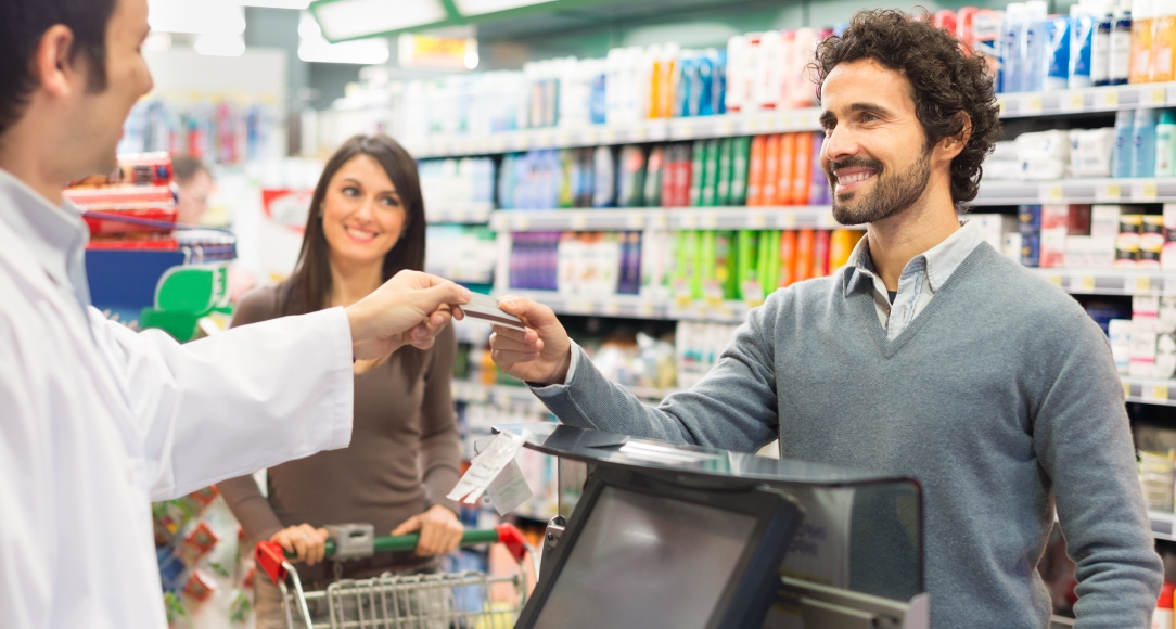
There’s a lot happening at retail right now. While independent retailers were deciding whether to implement contactless payments, other retailers began accepting biometric payments that include use of fingerprints, iris scans, and facial matching. That sounds strange until you remember you have been using your face to open your mobile phone for years. Amazon stores, including Amazon Go, Whole Foods Market, and Amazon Fresh currently employ Amazon One, a “fast, convenient, contactless way to use your palm to pay at a store, present a loyalty card, enter a venue, or badge into work” to move shoppers quickly through checkout lines.
Recycling and sustainability are not fads and the reselling of gently used items isn’t either. Currently, retailers like Macy’s, Nordstrom and JC Penney all have resale departments on their sales floors and shoppers can’t get enough. There is an opportunity here for you, too. Every crafter, for example, has a stash of material they are keeping for a future use that never seems to come. Why not devote a small section or rack to this product? Scrapbook and craft retailers have held in-store “Garage Sales” for years where customers bring in unwanted items to sell. Some retailers give sellers cash for the full value of items sold, less a 15% consignment fee. We prefer giving store credit, that way the money generated is recycled back into your store sales.
Yes, technology is everywhere, but the changes at retail aren’t all about tech. For example, designer stores have always used empty space to convey value, but now we are seeing that strategy carried over to other types of stores. Treasure hunt displays are still popular but even they are a little less cluttered than in previous years, and not just because the pandemic has made shipments scarce. There is a syndrome called the Claustrophobia of Abundance that can overtake shoppers when there is too much clutter and too many choices to be made. When there are 12 different kinds of grape jelly in the grocery aisle, or the dry cleaner offers an extensive list of options to have your shirts done, it can be overwhelming. And when it becomes too much some shoppers shut down.
So, what’s a retailer to do? Optimize the shopper’s journey.
Create and control the shopper experience
On the sales floor the goal is to move customers easily throughout your store by creating and controlling the shopper experience. You know that 50 percent of your store is never seen by shoppers, so your job is to artfully place fixtures, and set irresistible displays, that move them through the ENTIRE sales floor.
At the 2022 Retail Innovations Conference and Expo, we were introduced to goodMRKT, a store that supports a “community of makers and creators who are making a difference.” At goodMRKT, “products have a purpose, giving back is a given, and passionate entrepreneurs build a better future with the ‘goods that do good.’” This store on the show floor was peppered with displays set for maximum attention and highlighted with signs that explain what buying that product means to a community, like giving a week of clean water when you buy a coffee mug from Mud Love, or a blanket donated to a homeless shelter when you purchase from the brand Sackcloth & Ashes.
This display at a Taste of Benedicts & More in Crystal Lake, Illinois is different every time we visit, and we visit a lot. The chalkboard greets visitors with fun quotes and valuable information about the product that’s displayed on the table. You can see the smaller tables stacked underneath that can be easily pulled out to expand the display. Flexibility makes a visual merchandiser’s – that’s you – job easier.
Boutiques are great at increasing the average sale: shoppers come in for one item but leave with five. This display at a Nashville boutique utilizes cross-merchandising to increase impulse sales. Shoppers don’t just see the dress, they see the complete outfit.
Hello double duty! This table serves as a merchandise outpost and a window display. It’s shopping in the round so customers can easily shop from all sides. This is particularly important when the display is in or near a window.
The world is a carousel of color! You sang that didn’t you? In the 60s Walt Disney himself introduced a generation of children to the Wonderful World of Color, and what a wonderful world it is! Compared to other retailers you’re already ahead because your sales floor is a constant sea of color. You don’t have to depend on décor to put shoppers in the mood to buy, but you do need to consider how you put those colors together in your displays.
People react to colors in different ways. Red is an attention grabber; pink is a light-hearted, soothing color; orange makes people happy; yellow is optimistic, warm and cheery; green is calming and refreshing; brown signifies warmth and security; blue represents trust, loyalty, and confidence; and purple is typically used to symbolize luxury, wealth and sophistication. Both black and white are solid choices for backdrops because they make the merchandise stand out.
The Quarter Stitch, a boutique yarn and needlepoint store, located in the French Quarter of New Orleans is an explosion of color. Note the use of neutral décor that allows the merchandise to take center stage.
There’s never a dull moment at Leroy’s Place on Royal Street in NOLA. Atlas Obscura describes it as an “interactive gallery that makes you feel like you have stepped into a fantasy world.” We agree. This giant pink dude that greeted us is a puppet. We loved the splashes of color against the stark white walls.
Woodfield Mall in Schaumburg, Illinois taps into two trends here: Selfie stations and green walls. This one is constructed with inexpensive, but realistic, artificial green panels that are completely mobile. If you have room for a full-time selfie wall, go for it! Dress it up by season or event and encourage shoppers to post selfies to their social medias, along with your store’s hashtag.
There is always a buzz about the window displays at Anthropologie but did you know that each one has a specific theme that goes far beyond what’s in the window? This one is called “A Sunflower Story” and it commemorates Earth Day. The Story page on Anthropologie.com shares that the sunflowers are handcrafted and made from sustainable materials that will be upcycled to plant pollinator gardens later on. That Story page is an idea you should consider for your own store. You’ll get more mileage when you share your window story on your website, blog and/or social medias.
Nordstrom cuts and stacks pool noodles to add color to some basic outfits on blend-into-the-background mannequins. We’re not crazy about this window display, but we give Nordstrom a 10 for its use of props. Great ideas are everywhere! As you peruse the aisles or Target and Walmart and the like, think about how the unusual sale items you come across might be integrated into your store and window displays.
This fruit and vegetable display at a market in Barcelona, Spain is a showstopper. The produce is plentiful, it’s easy to shop, and the separation – contrast – of colors is perfect. You won’t see displays like this at your local grocer. The difference is that grocery stores expect you to buy; market displays like this one are set to entice you to buy. So, unless you are stacking cans of soda at a low price, never set displays that expect shoppers to buy. “Build it and they will come” is just a line from a movie.
It’s a well-known retail fact that displays with signs sell better than displays without them. The purpose of your signing program is to influence how customers shop and to encourage impulse sales. Lush covers both bases with two types of product signing at counter level, plus wall signing that’s guaranteed to capture attention.
We bet these chalkboard tags came from the wedding section of a craft store, don’t they make perfect little price point signs?
It’s perfectly acceptable to remind customers subtly and tastefully about the importance of shopping local. This sign is well-done and in line with the store’s brand theme. And it is far above the handwritten and taped pleas to shop small that we usually see on our Retail Adventures.
Visual merchandising will always be an essential driver of your success. Remember to keep a close eye on the product you carry, how it is presented, plus everything else necessary to increase customer dwell time – the amount of time shoppers linger in the store and at each display. You have a picture in your head of how your store is perceived; it’s important that customers share that same perception. Industry change is good, but so is change on your sales floor!
© KIZER & BENDER 2022 | Retail Adventures Blog | All Rights Reserved

